


Is Your Website Doing You Justice?
WORDS
Lauren Rhodes
Lauren Rhodes
THE PAPER
Thought Pieces
Thought Pieces
Interior design is an industry built around being looked at. Projects are photographed, published, posted and shared, and an enormous amount of thought goes into how that work is seen. Yet the website is often the one part of a studio’s public presence that falls behind, even at practices I admire most.
Working in branding means I spend a perhaps unreasonable amount of my week looking at interior designers’ websites. Casa Ren has always sat somewhere between my background in branding and Sharon’s in interior design, so we spend a lot of time thinking about how a practice presents itself, and what is actually going on behind the visuals.
And I notice the same thing surprisingly often: the practice has moved on, while the website has stayed much the same. Sometimes the website belongs to the earliest days of the studio, when there were a handful of projects, not quite enough photographs and considerably more reason to get something up and running, quickly. Then the work came in. The portfolio grew, the studio got busier and, rather inconveniently, nobody acquired an extra day in the week to rethink the website.
The edit gets harder as the work gets better
As a portfolio grows, studios tend to find themselves in one of two camps: too much work to show – an enviable problem, admittedly – or not quite enough of their own yet. For an established practice, the difficulty is deciding what stays. There’s the project that first got you noticed, the one that brought in a completely different kind of client and, inevitably, the apartment design everyone in the team still loves five years later. How do you take that one off?
But a website does not have to become an archive. Twenty projects do not necessarily say more than five chosen carefully, particularly if the work the studio wants next is not exactly the same as the work that made its name.
An emerging practice has almost the opposite problem. A designer might have spent a decade working on exceptional projects, then set up under their own name and find themselves with surprisingly little they can actually show. Some of that work may belong to a previous practice; other projects may be confidential. On paper, at least, they are starting again.
But finished projects are only one way of showing the work. Drawings, models, material studies, a corner of a site taking shape: all can reveal how a designer thinks, what catches their eye and the kind of world they are beginning to build. And then there is everything around it.

The world around the work
Interior designers collect things. Of course they do. Art, objects, antiques, old magazines, film stills, books, fabric cuttings, exhibition catalogues. A photograph of a doorway taken four years ago and never quite forgotten. A chair spotted through a restaurant window. The strange yellow of a wall somewhere in Sicily. Something picked up at a flea market with no particular purpose other than look at this (which is reason enough). And screenshots. An alarming number of screenshots.
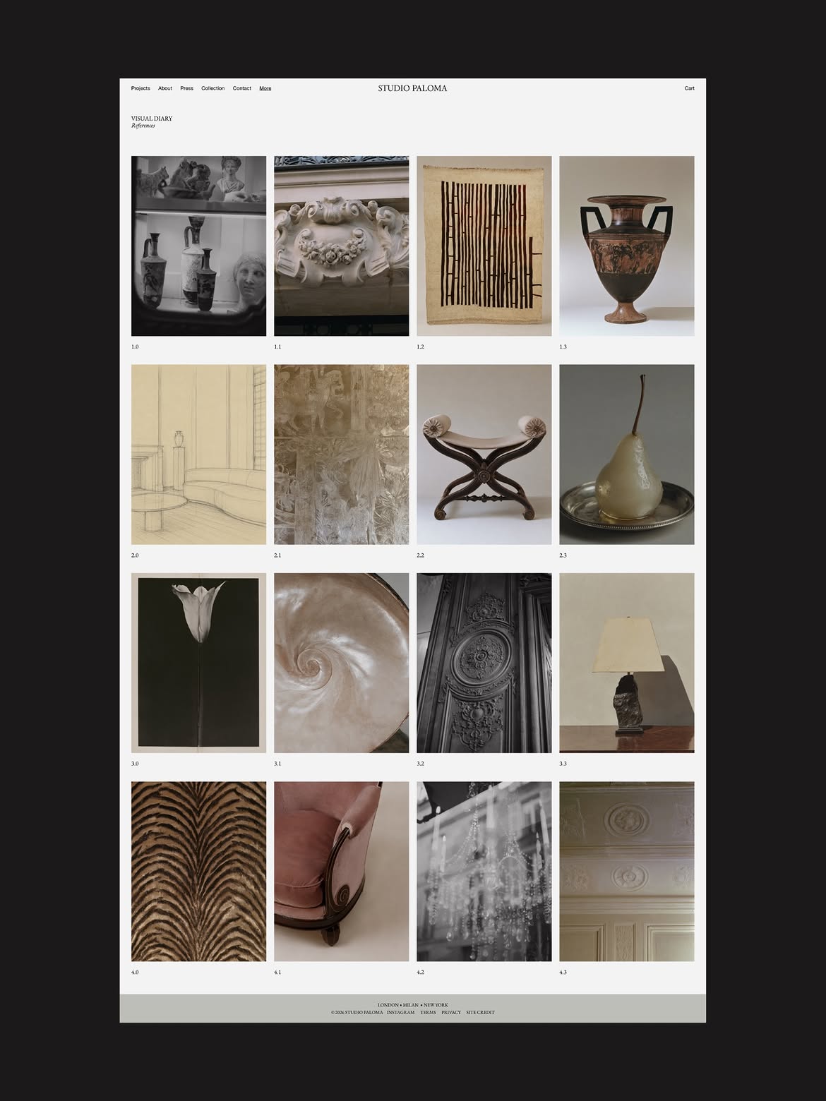
Most studios already have some version of this world spread across bookshelves, walls, camera rolls and saved folders. Very little of it makes it onto the website. Which seems a shame. This is why I wanted our websites to include a digital visual diary. Not a mood board, and not a page dutifully explaining how every reference eventually became a room. Something looser: an ongoing edit of what the studio is looking at, thinking about and finding interesting.
For an established practice, it can show what the finished portfolio cannot quite keep up with. What is on the desk? What are people bringing back from trips, buying at auction or passing around the office? And for the newer studio I was talking about earlier, still waiting for those first independent projects to be photographed, it can begin to show the eye behind the practice: artists, materials, books, furniture, places, photographs. You can learn quite a lot about somebody’s taste from what they choose to put next to what.
Interiors are slow. The house being photographed this month may have begun years ago, while the people designing it have carried on travelling, reading, collecting and becoming interested in different things. A visual diary gives the more immediate thinking somewhere to live.
Between bespoke and generic
When a studio decides it really does need to sort out its website, the options tend to sit at two rather different ends of the spectrum: a fully bespoke branding and digital process, or the optimistic belief that you will build the whole thing yourself over a weekend.
I come from branding, so I will always believe in the first option when a business needs it. Going to a branding agency means the opportunity to create something entirely bespoke to the practice, while also asking the bigger questions about who that practice is now and where it wants to go next.
For some designers, that process is exactly what they need. It is a significant investment, financially, certainly, but also in time, attention and quite a lot of decision-making. Done properly, it asks something of the studio too. But sometimes the identity is already strong. The work is good. The photography is there. The studio knows who it is. It is the website that needs attention.
At the other end is a generic theme, or an empty website and a free weekend. How difficult can it be? Then you start. Projects, image ratios, mobile layouts, navigation, journals, enquiries, typography, SEO. Sunday evening arrives surprisingly quickly and, for reasons you cannot quite explain, you have spent 45 minutes deciding what should happen when somebody clicks Projects.
And then there is the word template. Template has become a slightly unkind word. People talk about template slop now in much the same way they talk about AI slop: something made once, sold repeatedly and tweaked just enough each time. I understand why. There is plenty of it. But call me biased, I have always thought a template could be something else entirely. It is largely why we created Casa Ren. Ours are almost anti-template templates: incredibly detailed starting points, filled with worked examples, guidance and the small practical details that are easy to overlook until you actually need them. We get surprisingly deep into things you may eventually replace altogether. That is rather the point.
The aim was never to have hundreds of studios producing variations of the same thing. We give you a considered place to begin, then show you how to pull it apart and make it your own. The websites follow much the same thinking. Projects, journals, visual diaries, editorial pages, mobile layouts, optional commerce – even the decidedly unglamorous bits underneath – have all been thought through with an interior studio in mind.
There are still decisions to make, of course. Photography, typography, project selection, language, colour and scale are what give it its character. But instead of staring down a blank screen – or trying to coax a generic template, all oversized type and questionable animations, into looking like an interior studio – you begin with one already designed for the job.
The best bit? Making it unmistakably your own. If two studios begin with the same design, I do not want their finished websites to look the same. Ideally, you would never know they started in the same place. This is the space I have been interested in with Casa Ren: not a replacement for a bespoke branding agency, and not a generic theme waiting for beautiful photography to do all the work. Something in between, for studios that already know who they are.
Each design will be released in limited numbers. More on this soon, first with our community.
More Reads

II / Conversation
Does Your Work Look Like Everyone Else's?

III / Conversation


